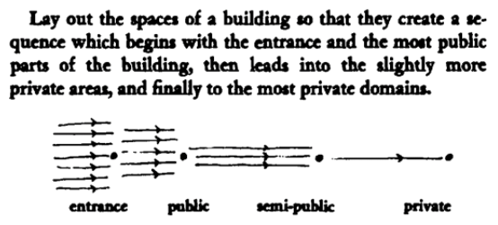
I am inspired by architect Christopher Alexander’s book A Pattern Language. One of its sections, Pattern 127 Intimacy Gradient, recommends ordering the spaces of a building so that public areas are closest to the entrance and private areas are more distant. Following this pattern creates what is called an “intimacy gradient” because the intimacy of adjacent spaces increases gradually as one moves toward areas that need greater privacy. The goal of such an arrangement is to avoid the awkward feeling of finding oneself close to a space that one really shouldn’t be near.
At past Burning Man events, the sake bar and interactive games were located at the road, and the camp’s common dome was farther back, with its entrance facing away from the road. This arrangment followed the Intimacy Gradient pattern. One observation by a camp member was that the public never ventured past the sake bar and into camp. It was clear to visitors that the camp space at the road was for the public.
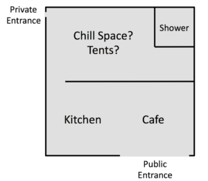
 Assuming that I replace the 500-sq-ft dome with a 900-sq-ft frame tent, I’ll need to create an intimacy gradient within it, or else everybody will be uncomfortable. One idea is to divide the floorspace of the tent into front and back halves using an opaque curtain. An opening in the curtain creates a U-shaped floorspace with the public area (the cafe) at one end of the U and the most private area (the shower’s curtained-off dressing area) at the U’s other end.
The space immediately behind the kitchen can be the camp’s normal private chill space. If the camp has only a few members, then this area could be used for tents instead.
To avoid camp members needing to travel through the public area to get to their tents, a private entrance could be provided on the side.